The New Dermcast.tv

Two years ago, Robert Higham and Radar came up with an idea. The idea was based on two beliefs: 1) the SDPA‘s industry partners needed a new and exciting platform to promote CME and products & services outside the confines of the dermPA.org website. And 2) the SDPA needed to start building up a media library of its own – an online media resource – so that people with an interest in dermatology could go and search through hundreds of videos, audio podcasts, pictures, posts, blogs, etc… with ease. That was the Summer of 2008. And the idea was Dermcast.tv. In November of that same year, we launched Dermcast at our Fall Conference in Tampa. It was a huge success. After Tampa came San Francisco, then Scottsdale, then Chicago in the Summer and now Grapevine last week.

Five events and two years later, with more than 100 videos and audio podcasts available on the site, Dermcast is now the #3 podcast on iTunes under “dermatology” and the site has seen tremendous growth in the last 12 months. Since Dermcast is such a niche topic, site traffic is relative. Considering the fact that there are only 2,000+ dermatology PAs in the U.S. today, seeing 50% of that number visit the site each week would be a huge success. When the site first launched in November 2008, average hits were in the 3-4,000 range per week. Today, we’re seeing anywhere between 10 and 11,000 hits per week. Page requests are up as well and people are spending a lot more time on the site watching videos and downloading podcasts to their mobile devices to listen and learn during their commutes to work.

In addition, industry partners like AMGEN-Pfizer, Intendis and Promius have come alongside Dermcast in an effort to connect doctors and PAs to their products & services.

So here’s the Dermcast of Tomorrow: last week we gave Dermcast a new look (see below). It’s easy to see which posts are the most recent, the most popular and the most talked about. Soon you’ll be able to type in any keyword (psoriasis, for example) and all of the videos and podcasts that correlate with that keyword will come up. Any mention of a specific condition or disease or product, etc… will be called out for you making it easy to jump to that section.

We’ll see more “branded podcasts” and less “billboards” – our goal has always been to make Dermcast a clean, non-SPAM site. So you’ll never be inundated with sponsored content. However, it is our goal to come up with new & creative ways to show doctors and PAs new products and breakthroughs in the field of dermatology. Dermcast will continue to be the industry leader in HOW that content gets delivered to the viewer.

Mobility is key and Dermcast makes it easy to take the content with you. Downloading podcasts from iTunes is easy and with our upcoming improvements to the site and versatile download options, you’ll be able to view all content from any device, even if you have a slow data connection.

Also, look out for videos featuring procedures, helpful tips and what other derm PAs are doing at their practices. And down the road, we’ll feature exclusive content that you can only see on Dermcast.tv and a rewards program that you won’t want to miss out on.

So that’s just some of the vision and success behind Dermcast.tv. If you’ve been using Dermcast, I’d like to get your take on it. Comment below or email us and let me know what you think. I know the board and all of the committee chairs at the SDPA would love to hear from you.
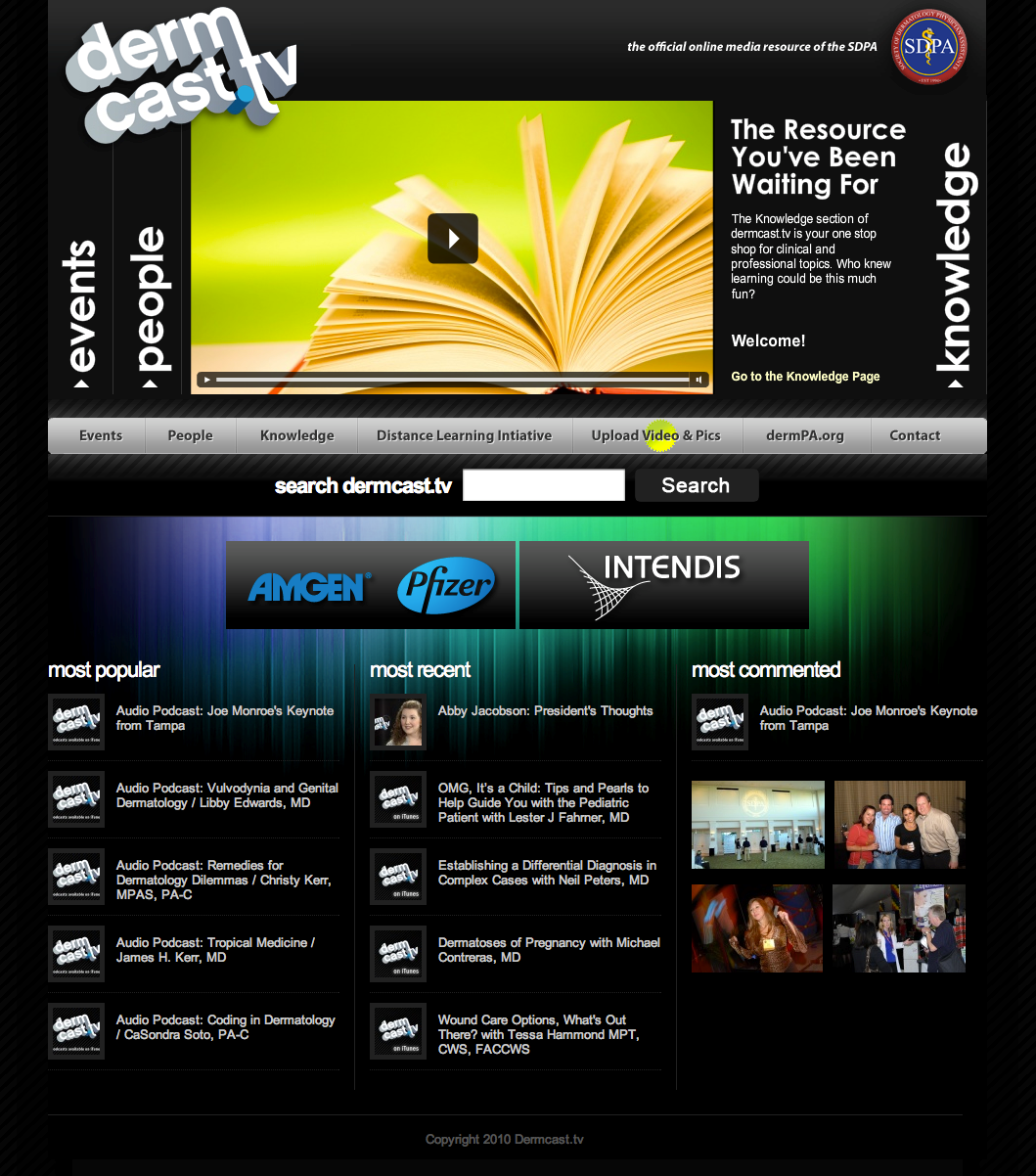
The New Dermcast
The New Dermcast

Project Kindle’s Dance Marathon at UCLA

We’re helping out our friends at Project Kindle today by producing the live webcast of their Dance Marathon at UCLA. Dance Marathon at UCLA 2010 is the 9th annual event of its kind at the UCLA campus. Seeking to educate, fundraise, and spread awareness about the global pediatric AIDS pandemic, Dance Marathon unites over 3,000 students every year in Ackerman Grand Ballroom to literally take a stand against pediatric AIDS.

More information on the event can be found here. Watch the stream, chat it up & say hello. We’ll literally be here all night (did we mention it’s a 26-hour dance marathon?). This year, they raised $407,223.73

5 Tips For Using New Media in 2009

For those of you who have told us you’re wanting to utilize “new media” in 2009, this is for you. Here are FIVE tips for using new media for your company or organization this year:

1. Start using social media sites like Facebook & Twitter

New media means bringing your brand to where your users/customers hang out. So if your users spend most of there time on Facebook, you should have a Facebook group or page setup. It’s free and easy and there’s no reason why you can’t set this up right now. Twitter is another great example of how brands are connecting with their customers in an easy & free way (see Starbucks, CNN, Zappos, etc…). Start building your social equity (you’ll soon learn that it’s worth more than your financial equity). Want more on this? Watch this. And if you don’t like Gary, you’re not allowed to complain until you get 92 comments on a single post.

2. Blogging is good. Videos are better.

Don’t just have someone in your office type up a bunch of stuff (ie: cut & pasted press releases, links, memos, thoughts on this or that, etc…). A bulletin board blog is boring and so 2008! Buy a $200 Flip HD camera and start shooting little videos to post on your website or blog (then link it up on Twitter, Facebook & Vimeo and let others embed it on their sites. Make it viral!). Interview your CTO talking about some of the upcoming products that will revolutionize your industry. If you’re worried about competitors “stealing” your ideas, keep it vague. Have an expert within your organization (say your CEO or COO or SVP of Marketing) talk about trends, themes or challenges facing your industry today, how they got to be the CEO, funny stories along the way, what’s next. What plans do you have to keep your company “more green”? Or what are you doing to stabilize your company through these tough economic times? How do you plan to stay innovative this year? There’s a 100 questions you can answer with a short 20-30 second video (I suggest keeping them under 3 minutes). If you only did a video a week you’d have 52 videos! Not bad. Listen to the comments. Respond to them. Reshoot accordingly. Re-post quickly. If people want more of a specific topic or want you to answer a specific question, go for it. People want to watch your company vs. read about it. And don’t be afraid to post videos of your customers. Let them be a part of the organization too. Have them sign a standard release form if your legal team gasps at the idea (which they will).

3. Engage your audience

Give them what they want. If your customers want to see more before & after videos, post them online. Examples of how to do something. How to use your products. Features & benefits they never even thought about. Highlights from a recent event. A promo video for an upcoming event. A day-in-the-life-of a [fill in the blank] to show the “real” side of what it’s like to [fill in the blank]. Give your viewers creative ideas & solutions so they’ll keep coming back for more (Williams-Sonoma does this really well with both their online recipes and how-to videos). And for the love of God, please RSS your website. Don’t know what that is? Click here. Have your fans shoot their own videos and submit them for a 6-month contest. The winner gets a new (fill in the blank) and also gets featured on your website in the Summer. Make it last 1 year or do 1 every 6 months to give your staff a break (also a great way to build anticipation for the next one). Remember, these don’t cost much – they’re affordable branded entertainment.

4. Go mobile

This isn’t the technology of tomorrow. It’s happening today. Companies like Amazon.com and SnapTell have already launched their mobile apps for users to connect with their brand while on the go. Truth be told, I did about 75% of my Christmas shopping for 2008 from my iPhone using the Amazon mobile app. What inexpensive app can you create to help connect users with your brand or products? Maybe it’s your entire catalogue of products or a free estimate calculator or featured videos from #2 that are only available on the app. Or keep it simple and make it a “lite” version of your website so viewers can see pricing, products, locate your stores, etc… Remember: 27 loyal brand evangelists are 1,000% more effective than a million people who drive by one of your billboards. Viral = strategic > ad noise.

5. Build your database

When people visit your site, get them to register. Make it easy for them to sign up and DO NOT SPAM them. Use it to build your database. Use it for strategic partnerships. But don’t use it to blast out weekly or even monthly emails to your followers (unless they want that – giving your customers or loyal followers options is probably point #6 but we’d say keep it to 5). SPAM’d followers will opt out of your list, guaranteed. Be smart about it but most of all, DO IT!

If you’ve read 1-5 and you’re now saying, “Well, yeah. Duh!” Chances are you’re already using new media to build your brand and connect with your base. Good job! Keep it up and we’ll compare notes. Next month I’ll share some best practices from our clients who are now starting to see the benefits of using new media in 2008.

[image from Creative Commons by Michael(tm) Smith]

Lucifer the Movie

RG Entertainment has tapped Radar Creative to create a website, DVD and movie poster for Lucifer, a movie being produced & directed by Ray Griggs of RG Entertainment.

Some of Hollywood’s top “A List” players collaborated on the movie trailer including cinematographer Russell Carpenter, a well-known film scoring orchestra, Cafe FX and ADI. Griggs plans on shopping the DVD trailer around town in order to raise the necessary financing needed to film the feature length movie.


Visual Trends: “Zoom-to-Reveal”

“Zoom-to-reveal” design (or ZTR as I’ll refer to it in this blog) is becoming more and more of a trend in the design world.

A few years ago, websites like Mapquest and Google maps introduced us to an old concept: zooming in to reveal more. You might be familiar with the work of Charles Eams and his Orders of Magnitude, but this concept of zooming in to reveal more information as it relates to the Information Age and not the Scientific World, is a newer concept. Let me explain.

With Google Maps, we can choose what information we want to see and on what level. You can choose Earth, continent, country, state, county, city, highway, road, sidewalk, ant… you get the idea. Stay at a higher elevation if you’re wanting to know where a person’s home is in relationship to the freeway; zoom in closer if you want to see where a person’s home is in relationship to the street (ie: end of the cul-de-sac, before the right turn, etc…).

So now companies are using this mentality with designing their sites. Stay at a higher elevation if you’re wanting to know where this company is in relationship to the industry (how do they compare with the other guys?); zoom in closer if you want to see where this company is in relationship to its clients (who are they working with?); zoom in even closer if you want to see where this company is in relationship to specific projects it’s producing (why are they different/better/smarter?).

The best example of this is Leo Burnett’s website: a creative ad agency in Canada. As you’ll see (after you’ve spent three hours of your life playing with their website), they apply this technique to their world quite brilliantly.

Another example I can’t cut & paste here is what TBS (a TV network in the U.S.) is doing with their graphics packages.

We found this website (browsegoods.com) — again, a perfect example of how ZTR is being used effectively in the design world.

What do you think? Is this just a fad or a new way of communicating in a visual world?

[image used with permission from Creative Commons by Yogesh Mhatre]

SDPA Calls on Radar…Again

The Society of Dermatology Physician Assistants (SDPA) has once again tapped RADAR for creative services on both internal & external communication pieces for 2006. The multi-phased account will encompass identity packages, direct mail, newsletters and pitch pieces for the San Antonio-based organization. For now, RADAR will deliver concepts for new letterhead, envelopes and business cards. RADAR recently designed & produced the new website for SDPA (dermPA.org) which has been a huge win for the organization since its launch back in November of last year.